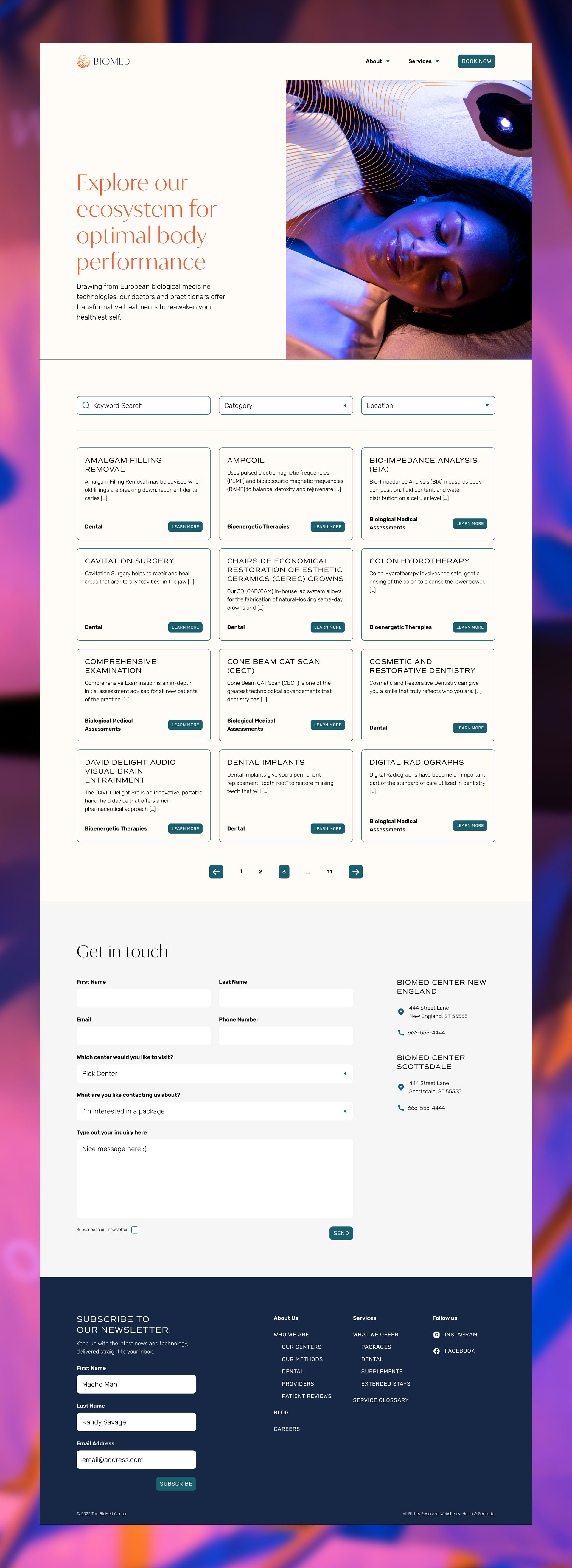
Ensuring that maximizing awareness and education is at the forefront of the design
Education and awareness are two of the most important parts of the center's philosophy, and this needed to be reflected in the new site experience. Their old website lacked any way for patients to view all their services and treatments online, so a "services glossary" was built to hold all current and future offerings in one place. Information about what each service is, what it helps treat, and where it's available were added to make engaging with their offerings as clear as possible, newcomer or a frequent visitor alike.
Visualizing the healing energy within our bodies
From logo to color, the new brand connects natural healing with cutting edge technology. "Healing Frequencies" is the narrative constructed around the inner energies of the body that The Biomed Center wants to tap into. This visual landscape is meant to be as soothing as it is technical, because healing should not only be empowering but personal and caring. Gradients are a core part of the branding expression and really match with the logo to emphasize the transformative nature of biological medicine.
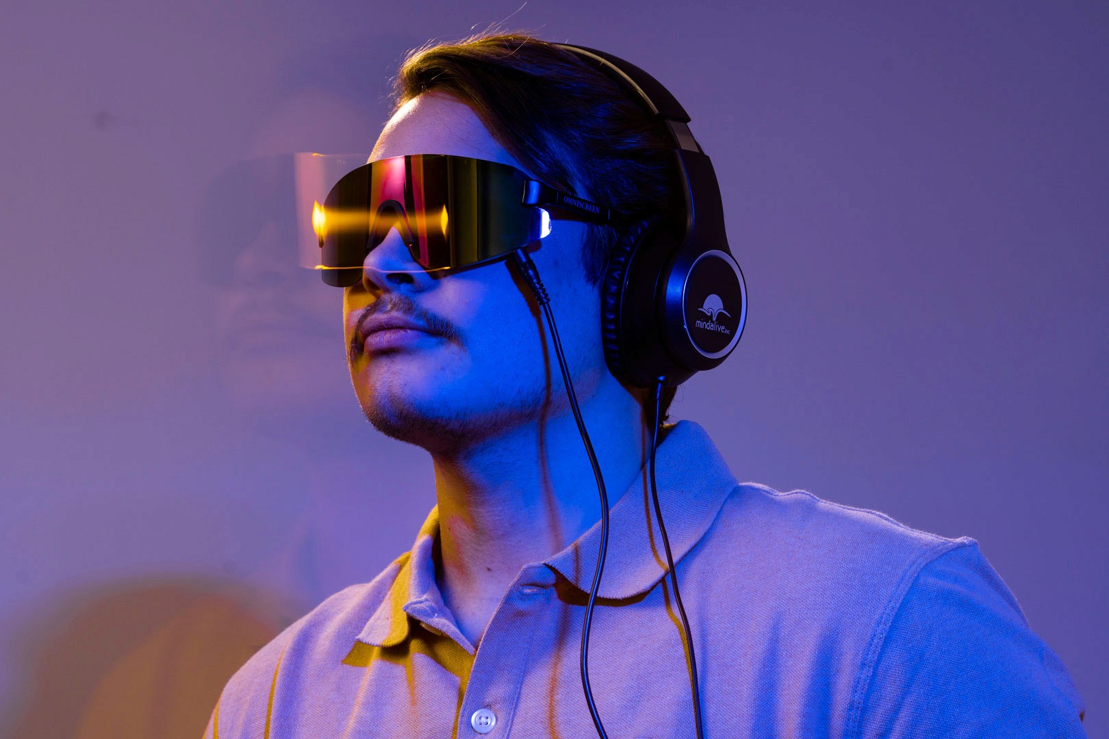
Beautiful updated photographs and videography to bring it all together
Working with the incredibly talented in-house production team, the art direction was translated and expressed in some all new imagery for the website and social media.

