YEAR
2024
MY ROLE
Web Design
STUDIO
Helen + Gertude
COLLABORATORS
Web Design - Allison Kunz
Copywriter - Jill Duff
Copywriter - Matt Kirsch
PROBLEM
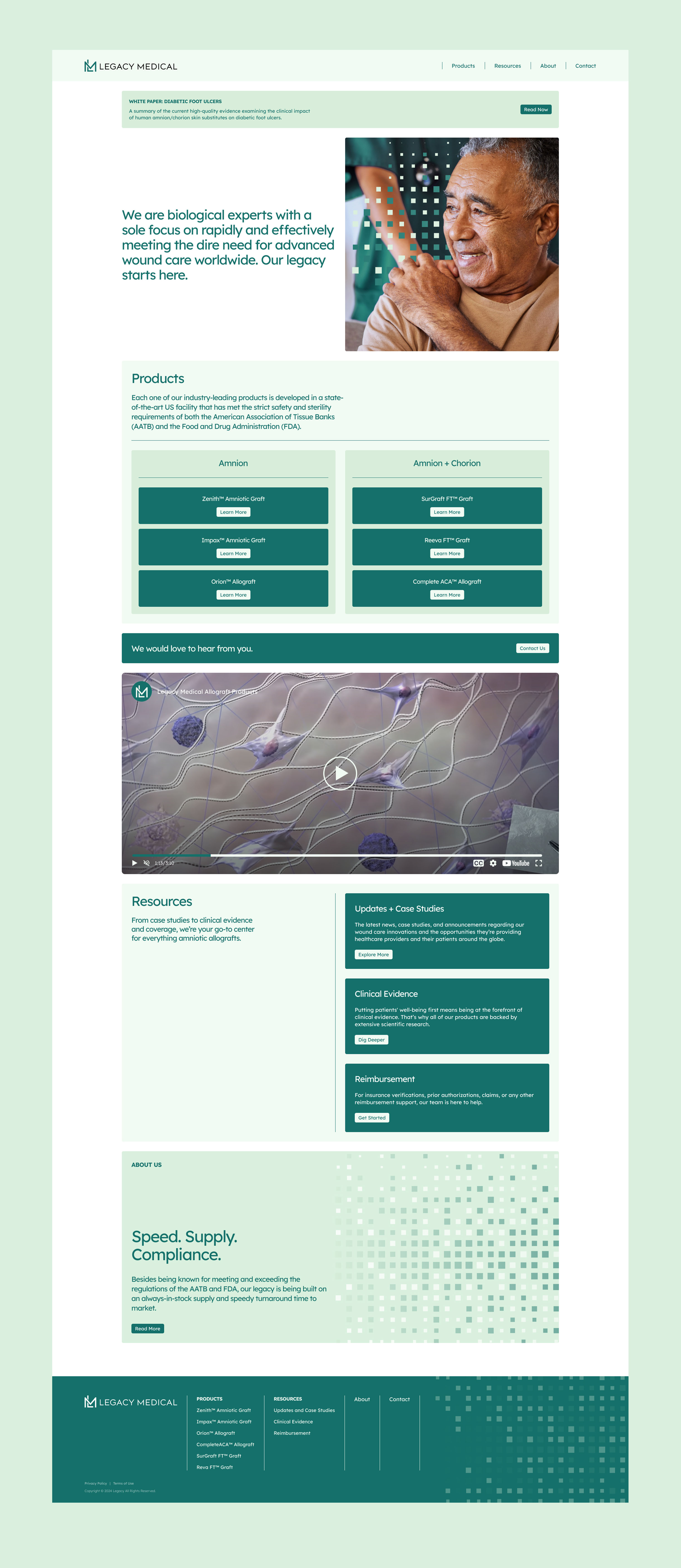
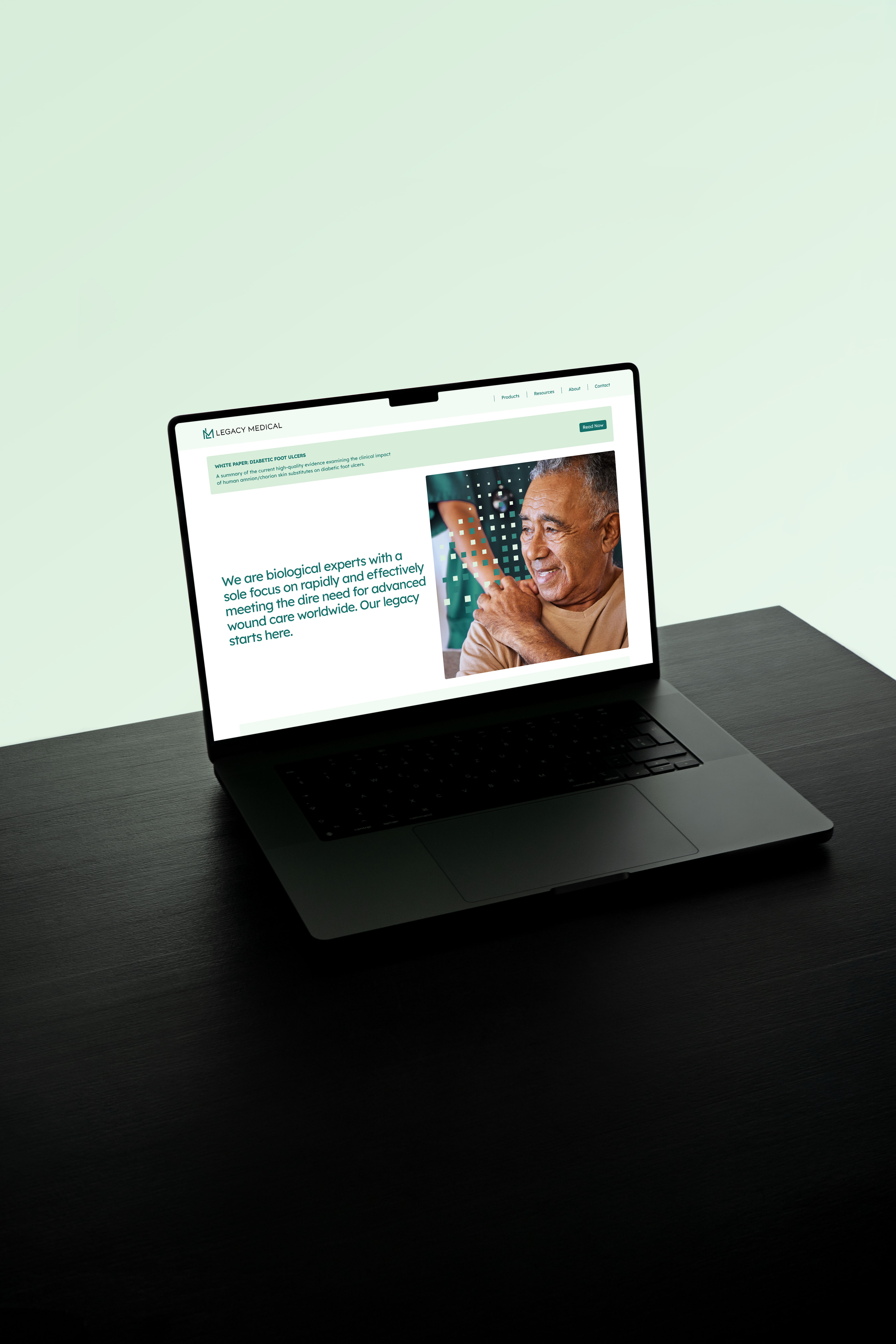
Legacy Medical’s old website lacked both fidelity and usability, was filled with outdated information, as well as missing large chunks of important information about their products and services that were important for both regulatory and general context.
SOLUTION
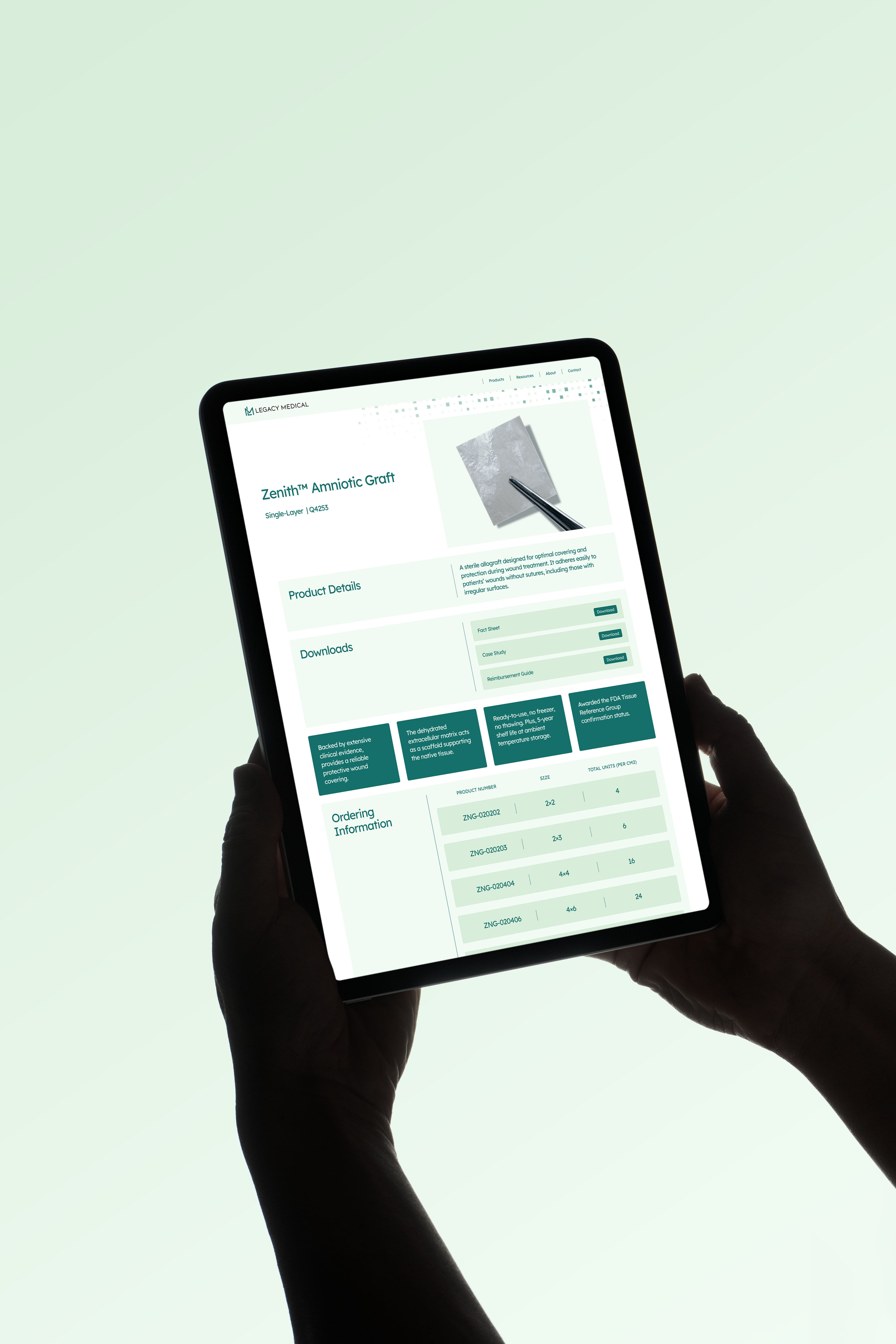
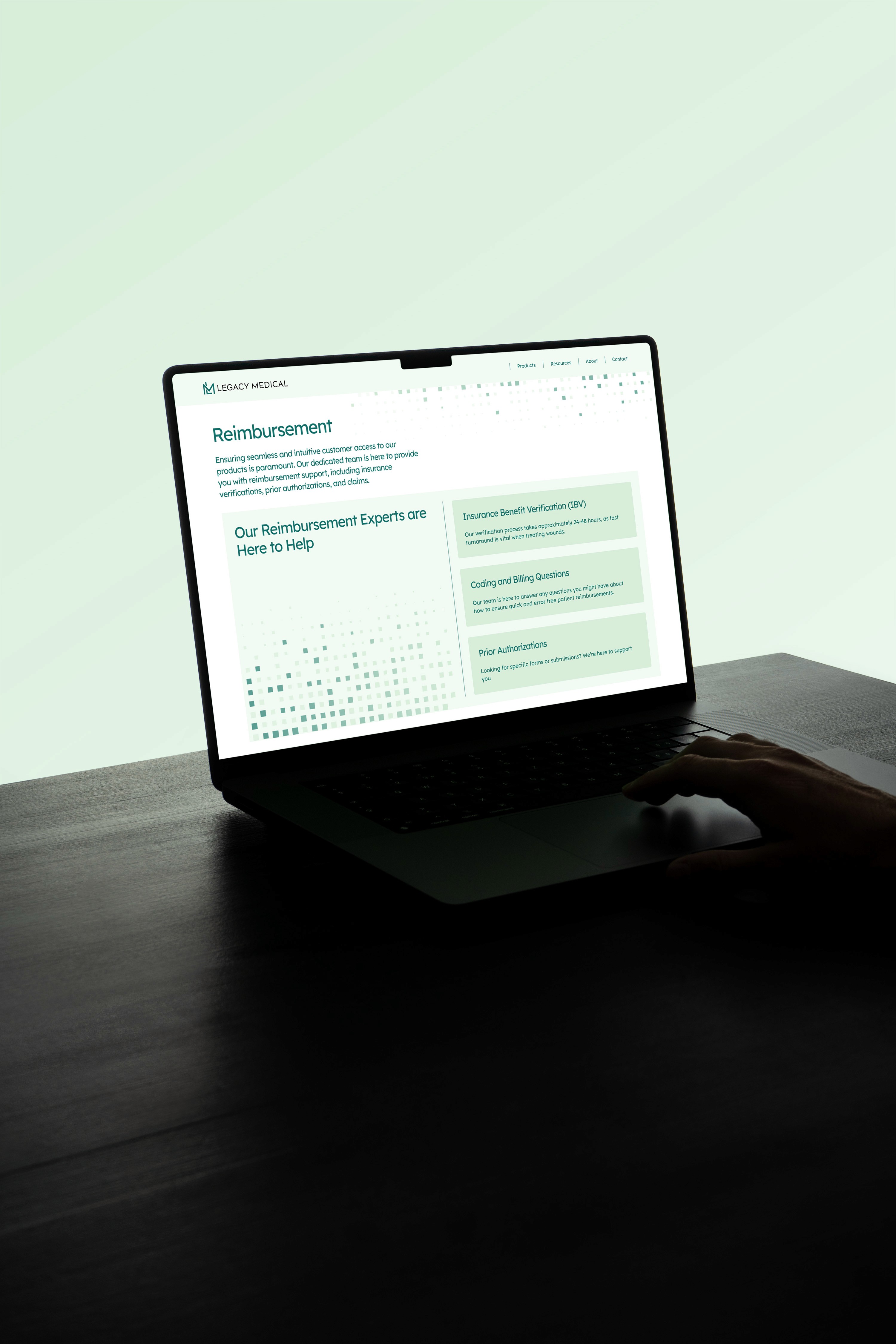
We re-structured and re-wrote the vast majority of the website, not only making it much more usable and accessible but generally informative about the company and their products. Items were recategorized in a way that was most intuitive from the viewpoint of the industry professionals. New pages were added for supplemental information like clinical evidence and a revised re-imbursement pipeline to make sure all necessary info is as easy to access and understand as possible.
